WHAT? UX/UI, Art direction, motion graphics, copywriting
WHERE? Student project at
Berghs upgrade - Digital design
WHEN? NOV 19'
THE BRIEF
The task we got was to improve the user experience and interface design to an existing e-commerce website, in my case, alina.se, which is a computer and IT reseller with shops around Sweden and e-commerce.
ALINA.SE
RESPONSIVE E-COMMERCE WEBSITE
RESEARCH METHODS
ANALYSIS
Interviews
Market analysis
Dibs 2018 e-handel research
e-commerce sites research
Customer journey
Workshops
Prototyping
Target group
Men and women 33-46 years old.
Young families with small children.
Target group's behaviour
- Confident, knowledgeable
- Prefers shopping via mobile
- Seeks a quick & smooth purchase
- Prefers paying with swish
- Wishes to save time
- Reaches the product page after googling a product
Target group's needs
- Clear & easy product page
- Comparison tool
- Customer Reviews
- Clear delivery information
- Mobile first
- Filtering Tool
Problem statement
Unclarity in information, price, total amount, payment methods, service and also an uncomfortable and time consuming page, leads to a frustrated and insecure customer which eventually leaves the page.
LO-FI WIREFRAMES, PROTOTYPES AND ITERATION

During this phase of the project I realised I was working out of a miss-consumption. I thought I should put as much information as possible at the top of the page so everything will be very accessible to the user. Eventually it created clutter and the opposite result to the clear design I was seeking, which led me to the following conclusions below.
WORKING HYPOTHESIS
Security in the purchase is built based on a clear and comfortable buying experience. When the customers feel seen, satisfied and respected they will return to the store.
DESIGN VALUES
Clear and airy design meant to give every component its own space and place. The design will go deep in the scroll and will lead the customers through their shop.
BRANDING
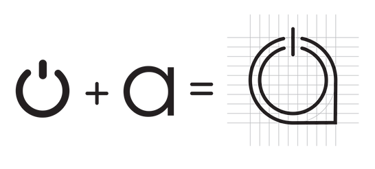
LOGO
COLOURS


I decided to keep the turquoise from the current Alina branding as a link to the brand, and combine it with black and white, colours which I associate with technical language but also with lights and screens.
TYPOGRAPHY, LANGUAGE AND ARROWS

One of the leading guidelines I had in creating this concept, was the insight that the user reaches a product page directly from google after searching for a specific product. The language I am using is inviting and empathetic, it should "speak" to the users and guide them through the shop. The arrows combined in the design are meant to help leading the users through the long scroll.
Since this branding is based visually on typography I needed a clean font with a technical feel. This font is quite narrow as well, which allows me to save space and use big typography.

Black
White
Turquoise #01CEEF
ICONOGRAPHY
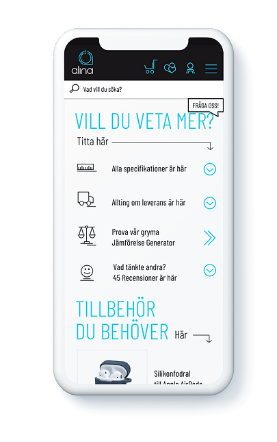
SCREENS


