BookBeat KIDS
APP DESIGN
MY ROLE UX, Art direction, icons design
WITH THE BEST TEAM Annette Emmoth, Lars Söderman,
Jeanette Claesson and Johanna Brag
WHERE? Group project at
Berghs upgrade - Digital design
WHEN? DEC 19'
THE BRIEF
BookBeat is a subscription service for streaming audiobooks. An important selling point is the family subscription which allows adding separate profiles for each family member to the account. As the growth of the total market has slowed down, focus is shifting towards offering the best possible user experience for all users in order to attract and retain customers.
In two intense weeks, we were asked to look at how to improve the user experience for users of family account child profiles, the specific scope was children 9-12 years.
RESEARCH METHODS
Interviews
Parents and users
Surveys
Around 80 participants
Market analysis
Reading habits statistics
Competing services study
Popular apps and games - user behaviour research
Prototyping & testing
Customer journey
Two personas
Double diamond method
Workshops
Design thinking
Value proposition canvas-
with the client
ANALYSIS
Target group
Two groups among Children 9-12 yrs:
1. In need of motivation to use BB
2. Frequently users
Target group's motivations
- Craft and create
- Get facts and information
- Sharing things with friends
- Get confirmed (prizes and trophies from the gaming world)
Target group's behaviour
- Scrolling quickly and vertically
- Limited focus and attention
- Easily switching between apps
- Clicking fast
- Looking for a familiar subject
- Most popular time of using the app is bedtime.
Target group's needs
- Big buttons and pictures
- Sharing and chatting possibilities
- Search tool that works well with spelling mistakes
- Parental involvement
- Customized and inspiring content
- Conformation method
HYPOTHESES
ONBOARDING FLOW
After testing each of the hypotheses through user testing of simple prototypes, we found that Personalisation had the most potential for our project. We set out to create a new onboarding flow incorporating our thoughts on how a new user could make and modify their avatar, choose their areas of interest, and also to show how the avatar could be present in the navigation.
Confirmation and awards
Based on our insight that awards and confirmations are important motivators in the gaming world as well as at school and daily life for children that age, we would like to check how might we use that to increase the time the kid stays in the app. For example, a trophy/new level badge for listening time or finishing a chapter or a book.
Sharing
According to articles and papers we read and interviews we conducted, for children 9-12 group affiliation and social interactions are important. This age group are used to and appreciate being able to share their digital experience with their friends. We will give our users the ability to share their experience from within the app, in an interesting, fun and quirky way - via text message or social networks. We also give them the possibility of writing book reviews, and commenting on other users reviews.
Scrolling
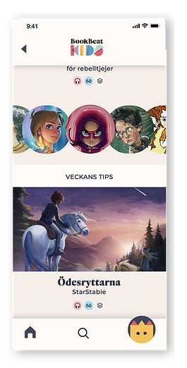
From our observations, children in our target group scroll very fast and non-stop. It also seems to be more natural for them to scroll vertically as horizontal content was completely ignored. We will adjust the user experience accordingly, by increasing the vertical depth and reducing the horisontal depth. We will also increase the size and clarity of the book titles and covers, to make them more easily perceived in this navigation tempo.
Personalisation
Our young users are creative and curious. They tend to have preferences regarding content and the appearance of what they engage with. We will give the users several ways to customise their experience: 1. Build their own avatar - pick colours, clothing, style and implement it in the navigation flow later. 2. Choose areas of interest to show in the content. 3. Customise the appearance of the app by picking a favourite background colour.
IDENTITY DESIGN
After the research we know our users need an organised and calm design with a creative and personal feel. I created this Bauhaus inspired mood board to give us a look and feel that matches our users' needs. It also adds an emotional and nostalgic dimension to the design because it's an old concept, like books, and it will help us to preserve the intimacy and the relationship between the reader and the book.

LOGO
Combined with the BookBeat original logo and made out of basic shapes. Creates a fun a playful look and feel.

TYPOGRAPHY
For headlines I kept the original font from BookBeat design but for texts we needed to have a good, san serif, modern screen font with a little vintage vibe.
COLOURS & SHAPES
Basic colours and shapes. The colours got a bit of a twist to make them calmer and more sophisticated.


ILLUSTRATED ICONS
The icons were designed for different categories. They are both complicated and simple. Made out of simple, basic shapes, but more detailed and illustrated then usual icons, to inspire and attract our users.


ONBOARDING FLOW


This is the outcome of an avatar test we managed to do the night before the presentation. It is the masterpiece of Alice, 9 yrs.

